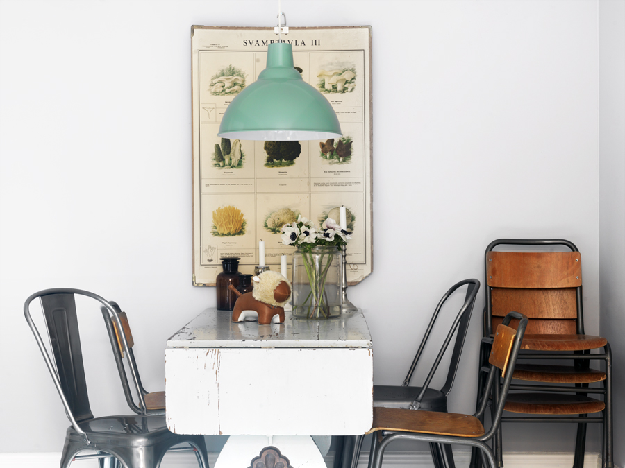
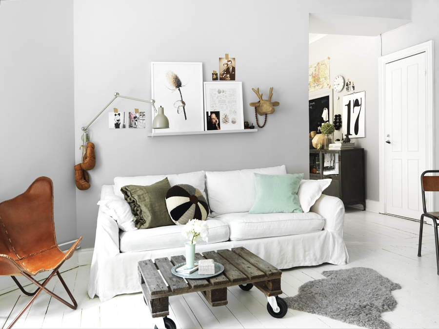
I guess the color seasons have changed for me again, from saturated moody colors, to soft pretty ones. I am loving all things pastely (new word alert :)) with a grey undertone. I really don't pay attention to Pantone's color of the year, even though I like to know for the sake of knowledge. I'm sure you too have heard by now that emerald is the color of 2013. So this brings me to my quandry, I have really been loving green's sweet cousin mint and aquamarine, and I wonder if it's because the green hue can be seen everywhere, and somehow it just snuck into my radar. Do you find that you start gravitating towards something just because it happens to be around, and without knowing it you've fallen in love?
Notice how the aqua and mint has been used in each of these spaces in small doses and how gorgeously it pops! It's a great accent color, using accessories to add it to a space.
What is your color crush, or design trend?
(Images: Linked to source)

No comments:
Post a Comment